Brainstorming
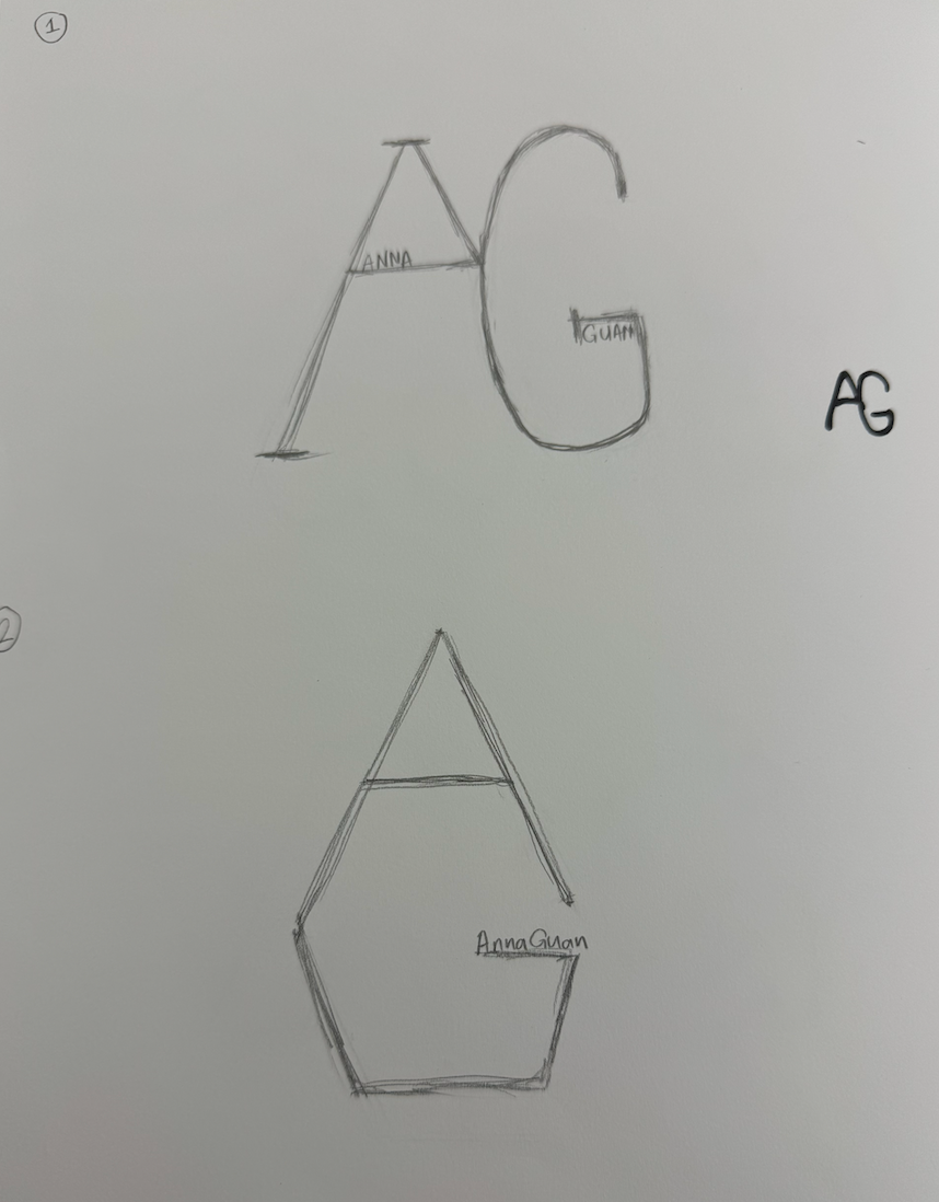
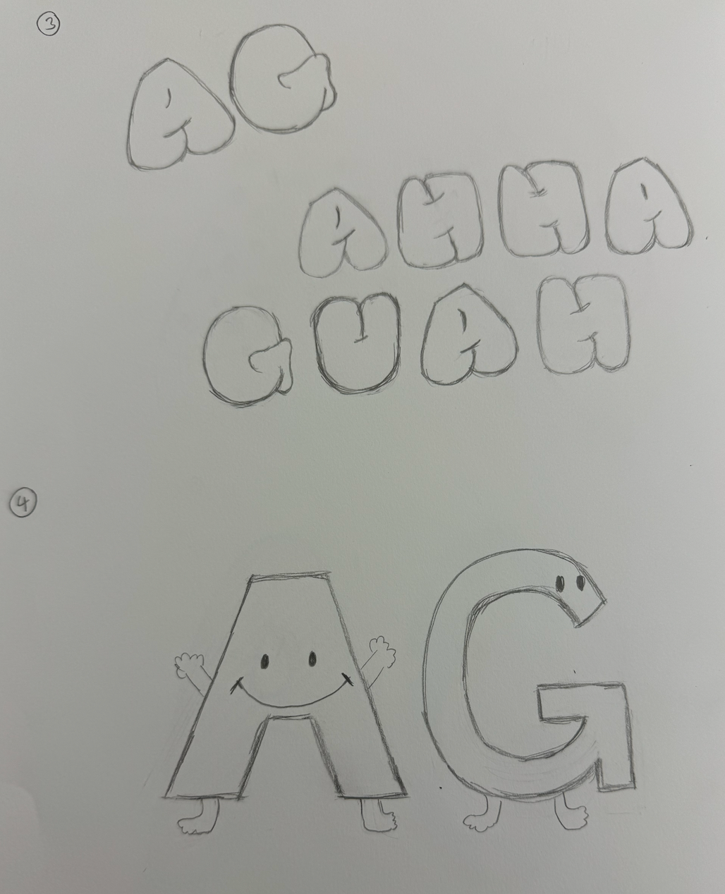
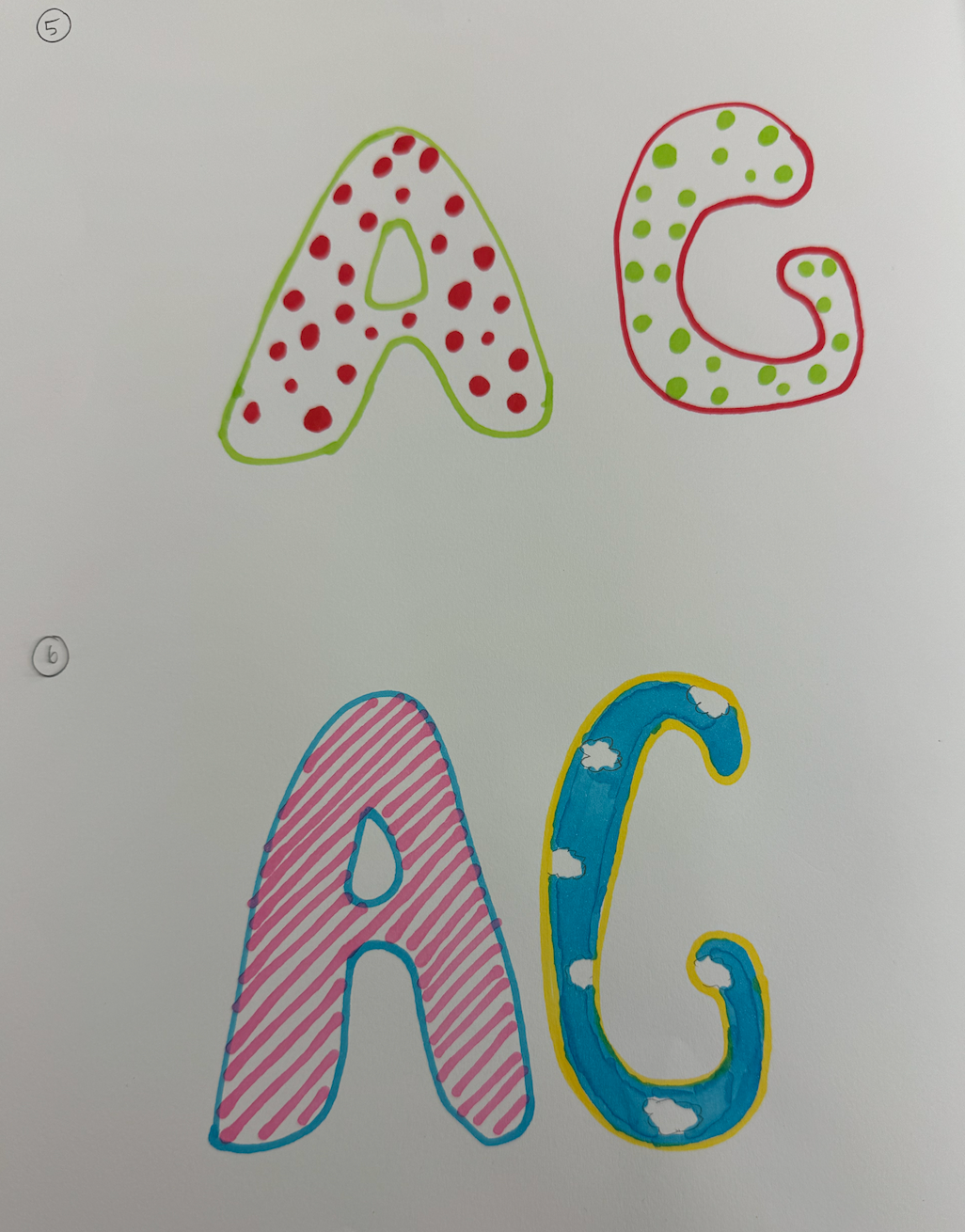
Starting with pencil on paper, I explored different interpretations of my initials "AG". My sketches ranged from geometric constructions to playful character designs, allowing me to freely experiment with various forms before moving to digital.

Process
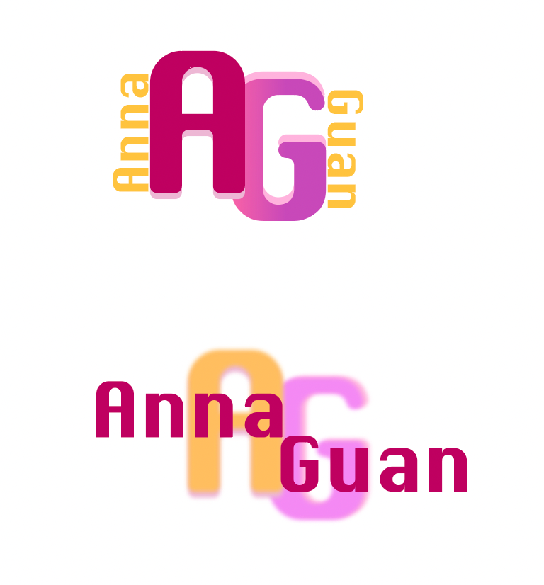
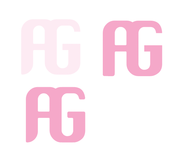
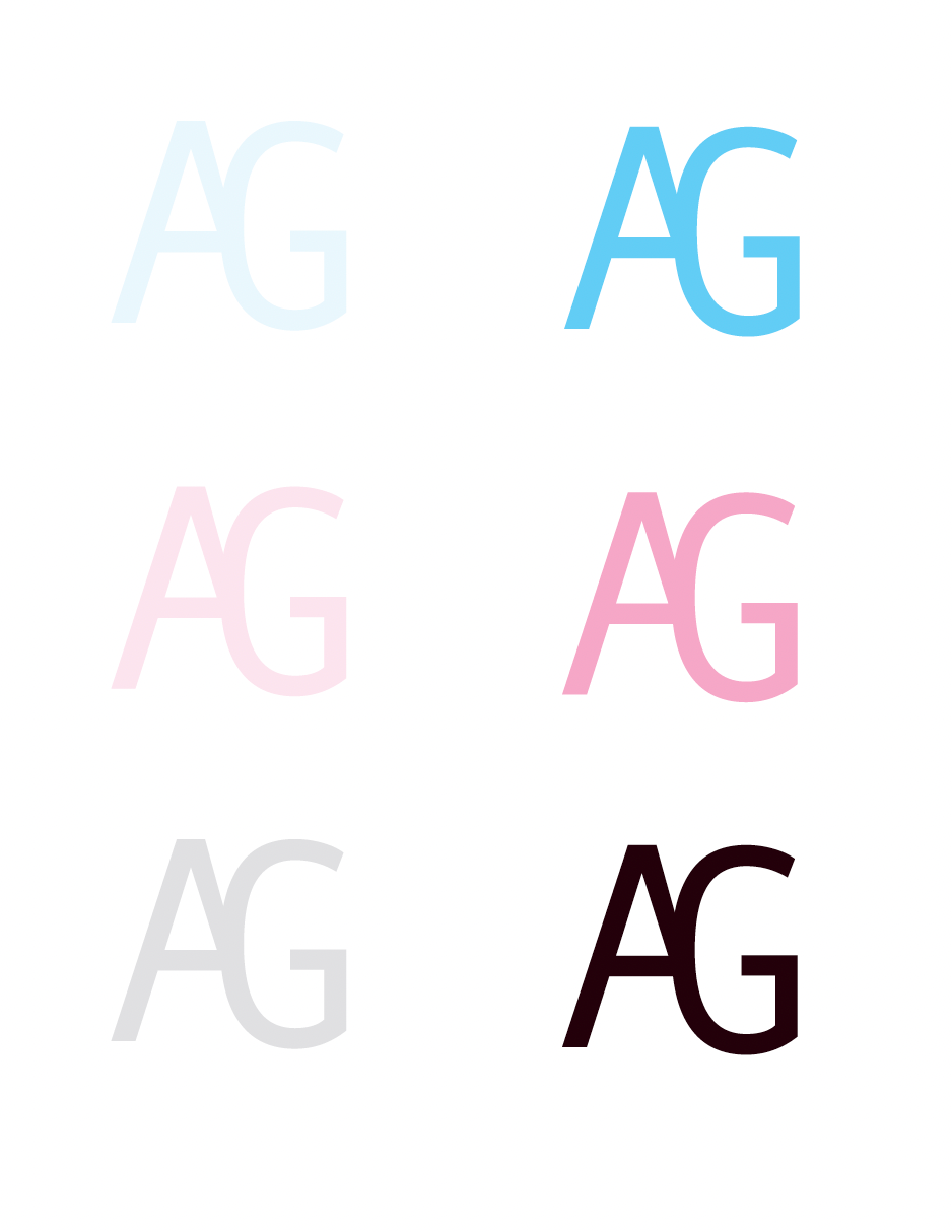
Through digital iterations, I explored typography, color, and composition. Each version taught me something new about balance and visual harmony. I experimented with different weights, styles, and orientations of the letterforms, gradually refining the relationship between the 'A' and 'G'.
Final Version
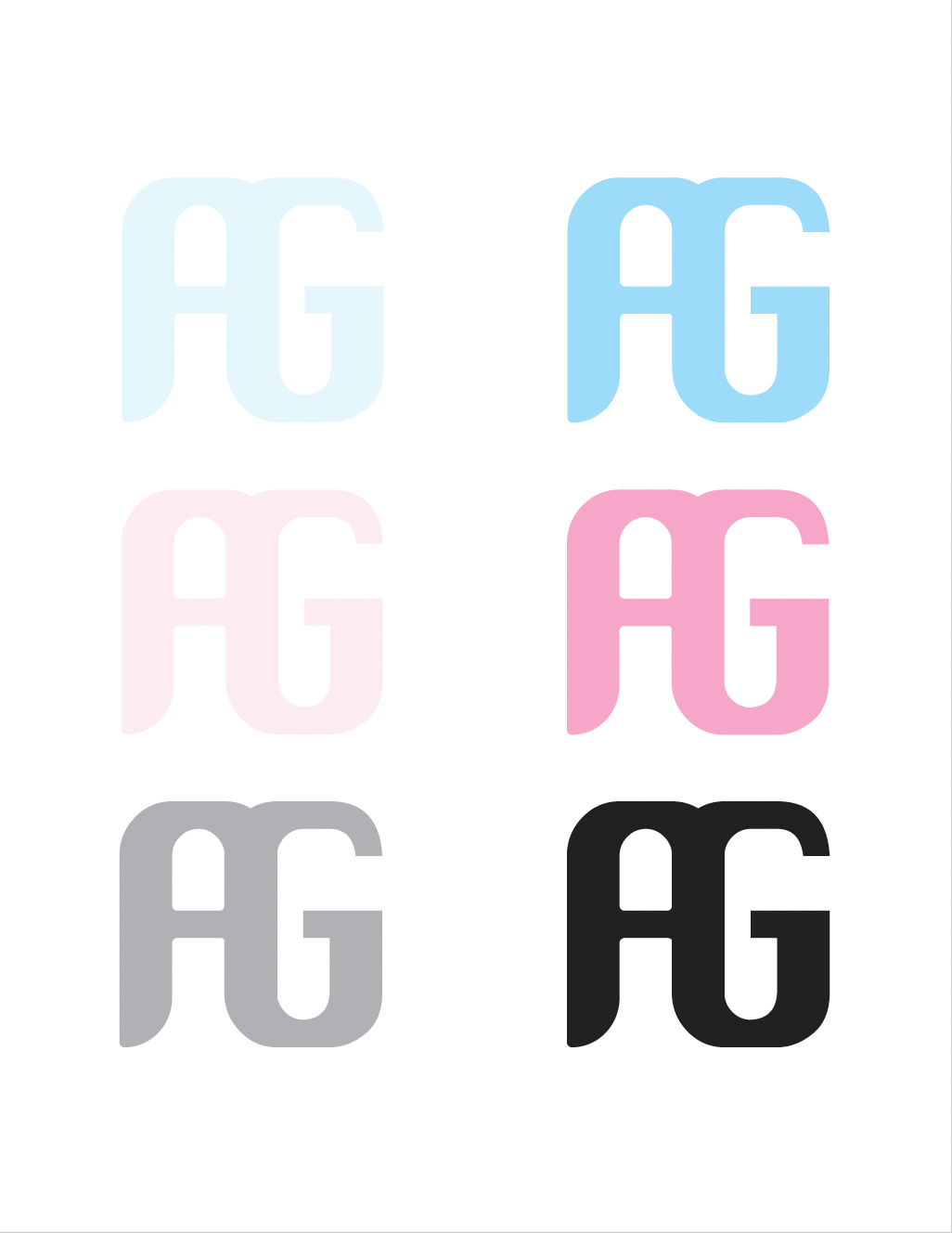
The final logo achieves a clean, contemporary feel while maintaining personality. By selecting a soft pink color and geometric forms, I created a versatile mark that works well across different applications while reflecting my design aesthetic. The simplified shapes and considered spacing ensure strong recognition at various sizes.


